
Vision
Manitoba Harvest came back to Expo West with more to accomplish than the year before. The 2025 showing proved a simple idea: a clean, sampling-first space gets product into people’s hands and keeps the brand moving in a crowded aisle. That foundation held. What changed in 2026 was the ask around it.
This year the brand wanted its sister labels on the floor too. Hi Ball Energy needed real visibility, and the team wanted buyers walking the natural products aisles to link those energy seltzers back to the same company behind Hemp Hearts and the Hemp+ powders. Tuk Tuk Go, the globally inspired protein line, came along for the ride.
That raised a practical design problem for STAR to solve. One footprint had to hero Manitoba Harvest, carry a second brand with genuine presence, and stay flexible enough to flex again at the next show. No second structure. No rebuild from zero every time a brand priority shifted.
STAR Solution
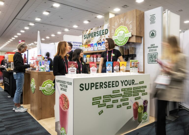
The answer started at the header. STAR designed an interchangeable logo system for the exhibit, swappable brand marks that drop into the same wood-grain crown and side panels without touching the build underneath. Manitoba Harvest stays the anchor under the “SUPERSEED IT” wall. When the brand wants to push Hi Ball Energy or Tuk Tuk Go, the identity changes in minutes, not weeks. One exhibit now does the work of three.
That flexibility is what gave Hi Ball Energy its moment. The energy seltzers earned counter space up front with their own “Clean Energy, Without the Compromise” story, sitting in the same line of sight as the Hemp+ boosters and the Hemp Hearts. A shopper sampling a snack cluster could turn and see the full family, all reading as one company rather than a shelf of strangers.
The rest of the environment built on what worked in 2025. The “SUPERSEED YOUR PROTEIN INTAKE” station kept sampling front and center, with cups lined up for high flow during peak aisle traffic. A “SUPERSEED YOUR…” word wall ran the language of how people actually use the products, from avocado toast to late night snack to recovery, turning the counter into a conversation starter. QR codes pulled visitors to recipes so the trial didn’t end at the cup. B Corp and Carbon Neutral marks stayed visible where buyers expect to see them.
This is the scalable partnership Manitoba Harvest first leaned on for an 8×10 reprint. The brief grew, the portfolio grew, and STAR’s role grew with it, from refreshing a single graphic to engineering a multi-brand system the team can reconfigure show after show.
Impact
Manitoba Harvest walked away with a presence that finally matched the size of its portfolio. The interchangeable logos did the heavy lifting on the year’s headline goal, giving Hi Ball Energy a credible foothold in front of natural products buyers and tying it cleanly to the parent brand they already trust.
Sampling stayed strong, the way it has every year, because the layout never stopped serving trial. The difference this time is reach. Every cup handed out introduced a shopper to a family of products, not a single SKU. And because the system is modular, the same structure carries forward, ready to spotlight whichever brand needs the push at the next event without a fresh build or a fresh budget for the bones.
Conclusion
The 2025 exhibit showed that a small, smart space can drive real trial. The 2026 exhibit showed what happens when you give that same space room to grow. A swappable logo system let Manitoba Harvest tell a bigger story, lift a sister brand, and keep the easy, hands-on sampling that made the original work. For a brand managing more than one label under one roof, STAR built something that bends to the goal instead of boxing it in.